Labels

Showing posts with label Design. Show all posts

Friday, 27 January 2012

San Francisco (second) impression

Do you remember my post about travelling?

I hope I didn't put you off by saying I was going to Chicago... it was my connection because my final destination was and has always been San Francisco. I had already been in San Francisco in September last year and it was great. I spent there only two days with friends who live there and I did what every tourist should do: visit the Golden Gate park and the Golden Gate bridge. I visited also the Lucas Art Digital head quarters (from outside) and Fisherman's Wharf. I also managed to ride a cable car and walked down Lombard Street. My visit was complete. So I thought until this January, when for business reasons I found myself again in the city of San Francesco d'Assisi. (If you've never gone to Assisi, the original city of San Francesco you should go, it's pretty cool.)

This time I didn't stay in the Cole Valley, but in a tacky hotel close to Union Square and I must say that my impression of San Francisco kinda changed. I think it's a great city, but never in my life I have observed so many different urban landscapes in so few blocks. Two blocks can mark the border between two different worlds; you can go from the financial district directly into China Town, you can be walking past fashionable hotels and then find yourself in a very dodgy area. Unlike New York, it's really weird to see beggars in the streets in San Francisco. Looking at people's harsh conditions should be difficult anywhere but the contrast between San Francisco's urban city and its population of jobless and homeless people stroke me with unexpected surprise and puzzlement. It was hard to see such a progressive city like San Francisco, show its ungenerous, difficult side.
http://www.allourtravelneeds.com
Also in giant metropolitan areas like London or Paris you can see marginalized people, but the rate in San Francisco felt considerably higher than in those European cities. It's hard to find explanations for this that don't fall into the realm of easy and predictable, but the gap between classes in the U.S. clearly presented itself in this occasion. To this respect I am pretty sure my perception is partial, and my knowledge of San Francisco is so superficial I shouldn't even be writing this post. But as far as the title goes this was only my (second) San Francisco impression.

http://www.lasplash.com


Another thing I noticed about San Francisco, is of course its distinctive architecture. The houses and their capability to stay straight is admirable. The viewer's perspective is always under stress and I kept on asking myself: is it me sideways or it's the street? are these houses really in plane?

Wooden or brick houses, they all carried a sweet after taste that reminded me of Hitchcock and other films noirs which intricate stories would take place in the streets and bars of San Francisco. I also found that San Francisco is more a "déco" city than other American cities. Yes, you read alright, "déco". Hotels, bars, shops, all use different fonts for their banners but they don't seem to prefer sans serif, modern fonts for those, and this preference contributes to the "retro" 50s&60s look of the city.

I loved it.


Sunday, 30 October 2011

Digital Design Management - dissertation

So cute to find my old dissertation slides buried in Google Docs...

Unfortunately I don't have speaker's notes... I should write them down.


Saturday, 21 May 2011

Opening movie credits (1)

Why is Jesse Garson not updating his great website page: http://www.phui.com/type/ anymore?

I don't know really, because this was truly a great initiative: analysing and awarding the best animated movie credits. I must say, the art of title helps as well but I wanted to make my very own list of favourite opening credits, and although the list is partial and I couldn't find a YouTube video of the opening titles of the King's speech here we go with my favourites.

Lemony Snicket's a Series of Unfortunate Events


L'amico di famiglia


The Shining


The Empire Strikes back


Contact


I know Star Wars is not so great, but hey reading about a "Galaxy far far away" always gives me a thrill...

What are your favourite movie opening credits?

Saturday, 2 April 2011

The presentation - Design Thinking


What you see here is a presentation I have delivered at work about the subject "Design Thinking". It's about what design thinking means, how it's achieved, and what are the good things everyone can try to apply and use in our work daily life. The presentation is public and the speaker notes will make it easier for everyone to read and understand the presentation that was mostly me talking over the slides.


Let me know what you think of the presentation and the subject.

Sunday, 20 March 2011

Business Design

Here is this lady, Heather Fraser, stating pretty much what I stated last time regarding how a design mindset can be defined.

It's really rewarding to see how right your thoughts and considerations might be, once a scholar states the same in an article.

Score!

Business Design

Sunday, 20 February 2011

Buzzword unveiled: design thinking

Design and design thinking are definitely buzzwords: they stand on the lips of many, but are understood only by a handful.

While performing some research for a future talk I'd like to give about design thinking and its value in the modern competitive landscape, I found myself gathering some material ranging from Wikipedia articles to books written by gurus of design management. As usual this activity seems to spark my synapses and I'd like to share with you, random or regular hypnogram readers, some of my thoughts about the real meaning of design thinking. I will start by saying what design thinking is not:

Design thinking is not a mysterious, indecipherable way of thinking only designers possess. Design schools simply provide their students with tools and stimuli to trigger  and train the right side of the brain, the one from which creative and lateral thinking stems from. Each and every human possesses the capability to solve problems in new and different ways: it's just that designers are way more used to it.

As Thomas Lockwood puts it in his book Design thinking, the word "design thinking is referred to the application of a designer's sensibility and mehods to problem solving"; and I can only agree with this statement.

Personally, I think of design thinking more as a general attitude,  a high degree of openness towards anything that is multidisciplinary exchange of knowledge, driven by a very clear purpose: the enhancement of experiences, being them tied to products or services. It is possible to identify three basic types of contributors (although many other disciplines can be involved): engineers, designers and business people.

A design thinking approach requires they all contribute to a project not only within their expertise domain but throughout all subjects involved, so to reach the best result from every point of view. Business people carry out the main task of facilitating designers and engineers in their technological and design challenges. They have to feel free to experiment and push the boundaries of what is conventional, of what is feasible and logical. Designers and engineers well into a design thinking approach will be open to any feedback/suggestion coming from anyone so as to include the best input into the work.

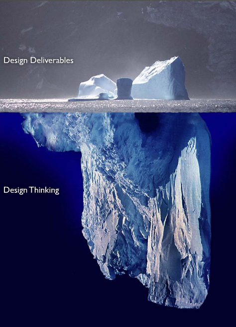
Given the knowledge and the skills: it’s all about being open, curious and focused. Good deliverables and disruptive innovation will follow. If not, a new lesson will be learnt and will be the basis for a new, more aware initiative.

If you want to know more about design thinking and design management, check the dmi website or simply... Google it!


Thursday, 4 November 2010

Seriously. IDEO

Seriously, I repeat myself: IDEO is an amazing company.

Not only it revolutionized the way design is perceived by businesses throughout the world; suddenly designers and design thinking for strategy isn't regarded as fuzzy buzz talk for fancy people who love to have their juicy salif on the kitchen table. It is an endless source of clever debate and inspiration.

Let's take patterns for example: it's a brilliant website where designers share their perceptions over patterns yet to become trends, but equally important and able to determine future scenarios. Patterns in design are what in business and entrepreneurship can be called windows of opportunity, and the two domains don't differ that much. A pattern is the early alert for a window opening, a chance to get first and better to a new and unexploited market space.

Suzanne Gibbs Howard gives some hint on how designers think and spot patterns in the IDEO column  for fastcompany.com

A good idea would be start following her on twitter and subscribe to patterns rss feed. Yes.

Thursday, 7 October 2010

The association power of Cinema

They say it is inevitable for a writer to write about herself, and this holds true for me too.
As tonight I was about to watch an episode of Heroes on dvd I found myself mumbling the tune of the Universal Studio opening title and I suddenly asked myself the question: how much do I like opening titles? Which one is my favourite one and, if there is... why on earth do I have a favourite movie opening title?
I will first start answering the first question by simply reviewing the opening titles that come into my mind first (did anybody hear in marketing what is "top of the mind"?). Here we are:

r

Ok, I am not an average movie watcher, but more of a movie geek, still these are my top of the mind production companies and their intros. Each of them conveys a special feeling, attitude that is the result of years and years of media exposure with positive associations perpetrated through the mass medium: cinema. I can only guess some of the important functions these logos and intros possess:


  • They associate the film with the production, and if the film is perceived as enjoyable or remarkable every single member of the audience will reinforce the positive association between movie and production:
  • They state something about the firm, they can be dreamy and playful like the Disney one, where the audience is asked to use its imagination, trying to anticipate the appearance of the castle shape: a clever use of the gestalt principles.
  • They can also state what the company mission as past and future. The Paramount pictures intro and also the WB one have changed several times over the years.
Going back to the first questions I asked myself, I must say my favourite one is the Universal Pictures one, I think this is mostly due to the fact that I associate it with Superman movies. Superman is my favourite super hero. Another reason why I like Universal Pictures one is because I perceive it as sumptuous, solemn, something that drags attention because is... universal.

What is your favourite movie intro and can you tell why?


Monday, 16 August 2010

Advertising, who said it's not art?

At least to my knowledge advertising is sometimes perceived as a minor art. A diminishing way of using graphics, music and cinema for commercial purposes. Commercial purposes are indeed seen as the culprit, as a sort of evil goal which effect is to turn everything around it in mere business, sucking the beauty of free, unconventional and revolutionary thinking. I say:

Advertising is art.
Advertising is mastery of media and content.
Advertising is a way to spread unconventional, revolutionary and free thought.

Modern advertising in fact, doesn't rely on a promotional style of communication. Consumption and purchase are not at the core of advertising anymore. First there was the product and it was good. Sell the product and forget about it, let the audience know how it's used and what it is for and who cares what happen next.

Nowdays you almost never see the product in the ads, and if it's shown it's not invasive. It just fits into the story (at least in good ads). This is because today's consumer don't buy products, but ideas, ideals, feelings, social forgiveness. Products and services are vehicles of self awareness and self acceptance, they are a way to express someone's attitude towards different subjects and themes, but they are also a medium for people to learn more about themselves. The complexity of such messages makes advertising quite a respectable form of art. It is certainly fueled by a business reason, but many times this reason is left behind; quietly left standing in the backstage of a more ambitious show.
This thought came across my mind tonight while surfing on "Ads of The World", a comprehensive aggregator of the most interesting content advertising can offer. There you can find loads of award winning commercials and print ads that are simply brilliant for both execution and storytelling, like the one I saw for Amnesty International's campaign against death penalty.

Tuesday, 4 May 2010

The Greek crisis, what now?

The Greek crisis is popping out everywhere you read, on every channel you end up on, so: what is it about?
Well, I'm not the right person to give you a detailed insight on the matter, since there is quite some material already available over the net. What I can provide you with is the first Episode of what already looks like a nice series of videos made to explain in simple terms what this crisis is about. Thanks to Nomint.


The Greek Crisis Explained, Episode 1 from NOMINT on Vimeo.

Friday, 16 April 2010

It's not a common Chrome extension

I love Google Reader. It is simple, not invasive, organized and great for sharing relevant content with a lot of smart and interesting people. Really, I love it, but recently I got a bit bored. I wanted to filter more content, wanted to see more things at one time, so I decided to go for some Chrome extension to help me cope with my "information overflow" and there I found: Feedly.
The creators of Feedly really know how the print and newspaper media work and attract readers; their extension allows for visually compelling reorganization of content coming from the feeds in a mosaic-like way. Just a glance and you have visuals, titles, summaries at your fingertips (or your eyeballs) in a cool visual way, with great room for content organization.
The nice thing of Feedly is its immediate synchronization with Google Reader. At the beginning I didn't realize how all of my feeds were duplicated into this new extension page, but it took me just a second to notice that the Google Account served me well.
As also Donald Norman says pretty and beautiful things do make us happier in using them. They give back pleasure and we enjoy using them for their functionality but mostly because they fulfill the need for aesthetic. Feedly is aesthetically enjoyable and functional. I am totally recommending it to anyone of my readers and assuring I will be using it quite a lot.

Sunday, 7 March 2010

Apple vs Google - a (special) love story

Only this morning I stumbled in this Wired.com article about a patent infringement lawsuit filed by Apple against HTC, the manufacturer of the so-called Googlephones. This is an evident attack to Google's attempt to offer an alternative to the smartphone market. Reading the article, Wired's writers state that if Apple were to win in this confront, Google's inability to use certain technologies would make the Googlephones ugly, or not as pretty as the iPhone. This is pure nonsense. What is "pretty"? We think the iPhone is pretty, because it respects universal principles of design of uniformity, symmetry, softness and simplicity affecting our perception in a way we are not aware of. It is important, though, to distinguish pretty design, from dominant design, that is what the iPhone is slowly becoming. The QWERTY keyboard is an example of dominant design, but it certainly isn't prettier than the DVORAK keyboard. Pretty ≠ Dominant Design. Many pretty things didn't make it to the technology clash. Same holds for a misconception of the "first wins". Apple's pioneering technologies now look as the dominant design setters, the ones that know what's pretty and what is not. Unfortunately the mobile phone scenario isn't as simple as the previous sentence: there are many different designs and control system that can fall into the beautiful and useful paradigm, the iPhone is only one example. That's all.

Sunday, 14 February 2010

Coolinfographics


Infographics is an amazing way of representing key data in a creative and understandable way. Coolinfographics is the place to go when you're looking for some data you want to visualize... or for some cool presentation like this one:


http://www.coolinfographics.com/

Tuesday, 17 March 2009

Wordle.net - I love it

Wordle.net is a brilliant java application allowing you to transform pieces of your favourite texts, of even your thoughts, into awesome typographic samples. It compares the frequency each word has been used attributing them different size. You are free to express yourself, though, by determining color range and some other visual arrangements.

 Wordle: thesis
Related Posts Plugin for WordPress, Blogger...